A design system that ended UI debates across three fintech products
How we standardized tokens, empowered engineers, and unified a growing fintech ecosystem.
The business platform had outgrown its design library. Reusable parts were everywhere, but shared standards, documentation and governance were not. This is the plan and the design work behind turning that library into a real design system, delivered as a focused three-week sprint with a demo and sign-off at the end of every week.
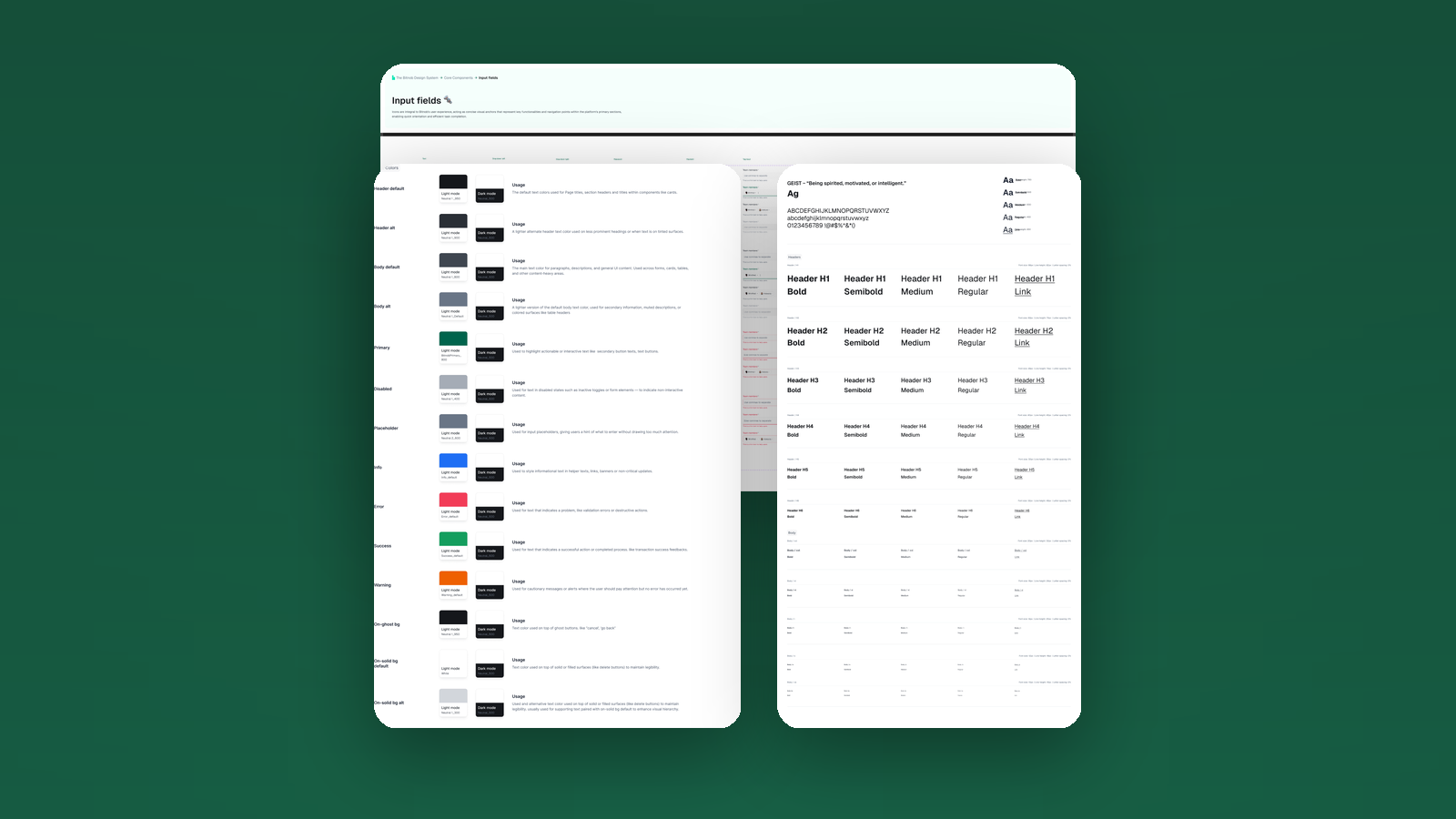
A library is not a system
We had a design library: a useful collection of reusable components and styles. It made individual projects faster, but it lacked the structure, interconnectedness and governance a multi-product ecosystem needs to stay consistent as it scales.
The gaps showed up everywhere. UI patterns and styling varied across the platform, designers and engineers spent real time rebuilding parts that already existed, and every new feature quietly re-opened the basics.
- Inconsistent UI patterns and flows across products
- Inefficient workflows and rising design debt
- Consistency getting harder as the platform scaled
- A steep ramp for new designers and engineers
A library gave us parts. To move faster without fragmenting, we needed a system: shared standards, a single source of truth and governance to match.
A design library gives you reusable parts. A design system gives you a single source of truth.
The aim was not to produce another pile of assets, but to establish a foundation that lets teams build exceptional experiences faster: accelerated development, consistent branding, a better user experience, less technical debt, and smoother collaboration between design, engineering and product.
A three-week sprint to one source of truth
We timeboxed the core build to three weeks: foundations in week one, core components in week two, and complex patterns plus governance in week three, closing each week with a demo and stakeholder sign-off.
From design library to design system
First I wrote the plan: what a system is, why a library was no longer enough, and what success would look like. Aligning stakeholders on that up front, and agreeing a timeline, is what made the rest move quickly.
Principles came first and stayed live throughout: clarity, accessibility and efficiency, documented as the philosophy the system is measured against.
Week one: principles and brand foundations
Week one was foundations. Before any component we set the vocabulary the whole system would speak, from brand voice and tone down to the primitives every screen is built from.
- Core design principles: clarity, accessibility, efficiency
- Brand identity, voice and tone guidelines
- Foundations queued up: colour, type, spacing, grid, icons, elevation
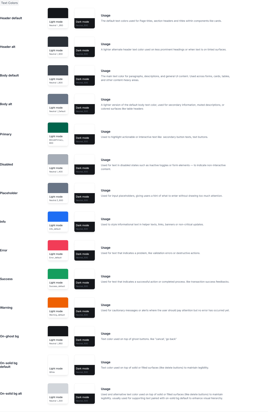
Colour
The colour system is fully semantic. Base colours become named tokens (primary, secondary, accent and utility), each mapped to a light and dark value, with contrast ratios checked so text stays accessible everywhere it lands.
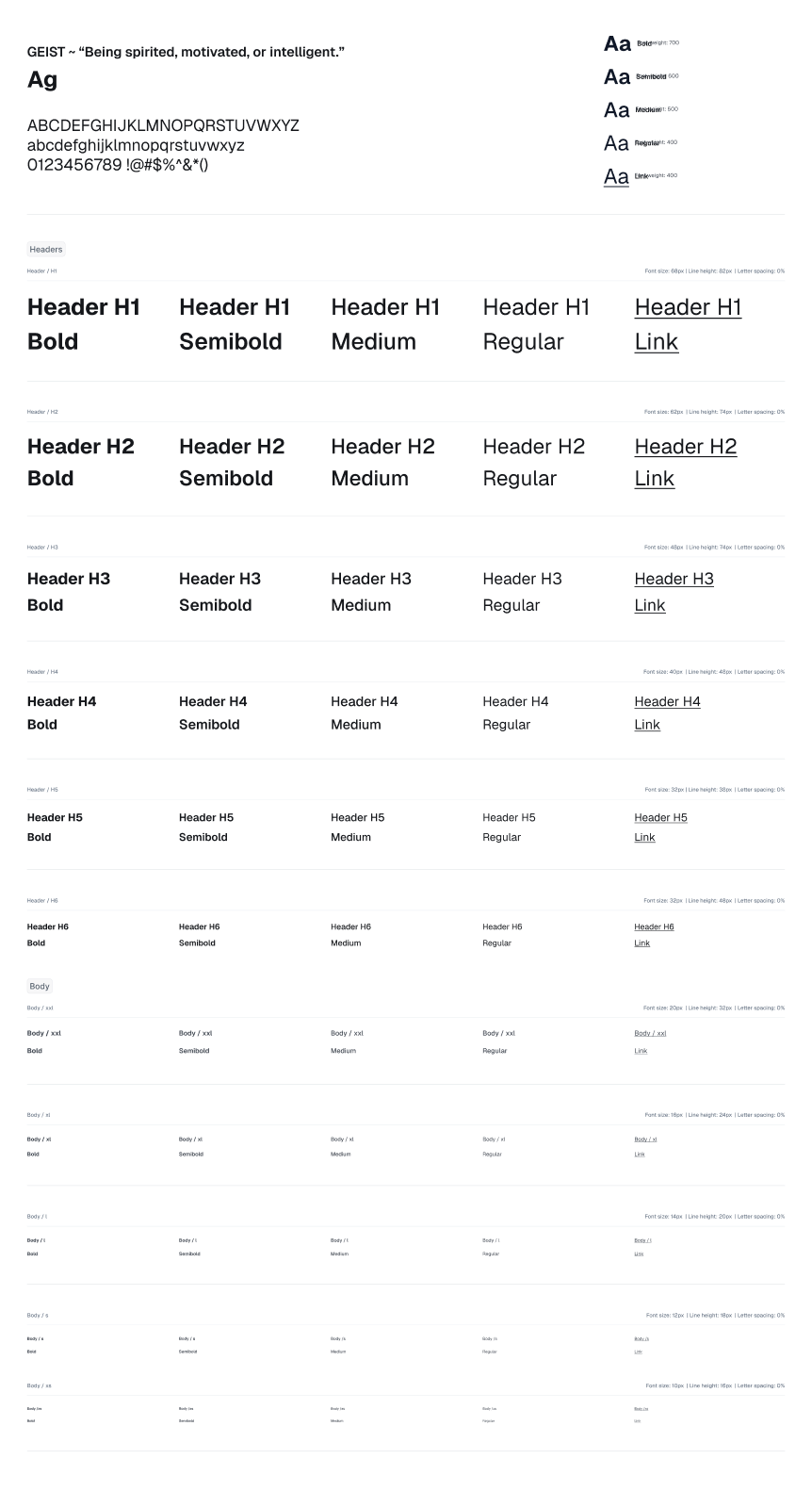
Typography
Type is defined once and reused everywhere: font families for headings, body and code, a full type scale for size, line height and letter spacing, and text styles for weight, emphasis and links. Geist anchors the system as the brand typeface.
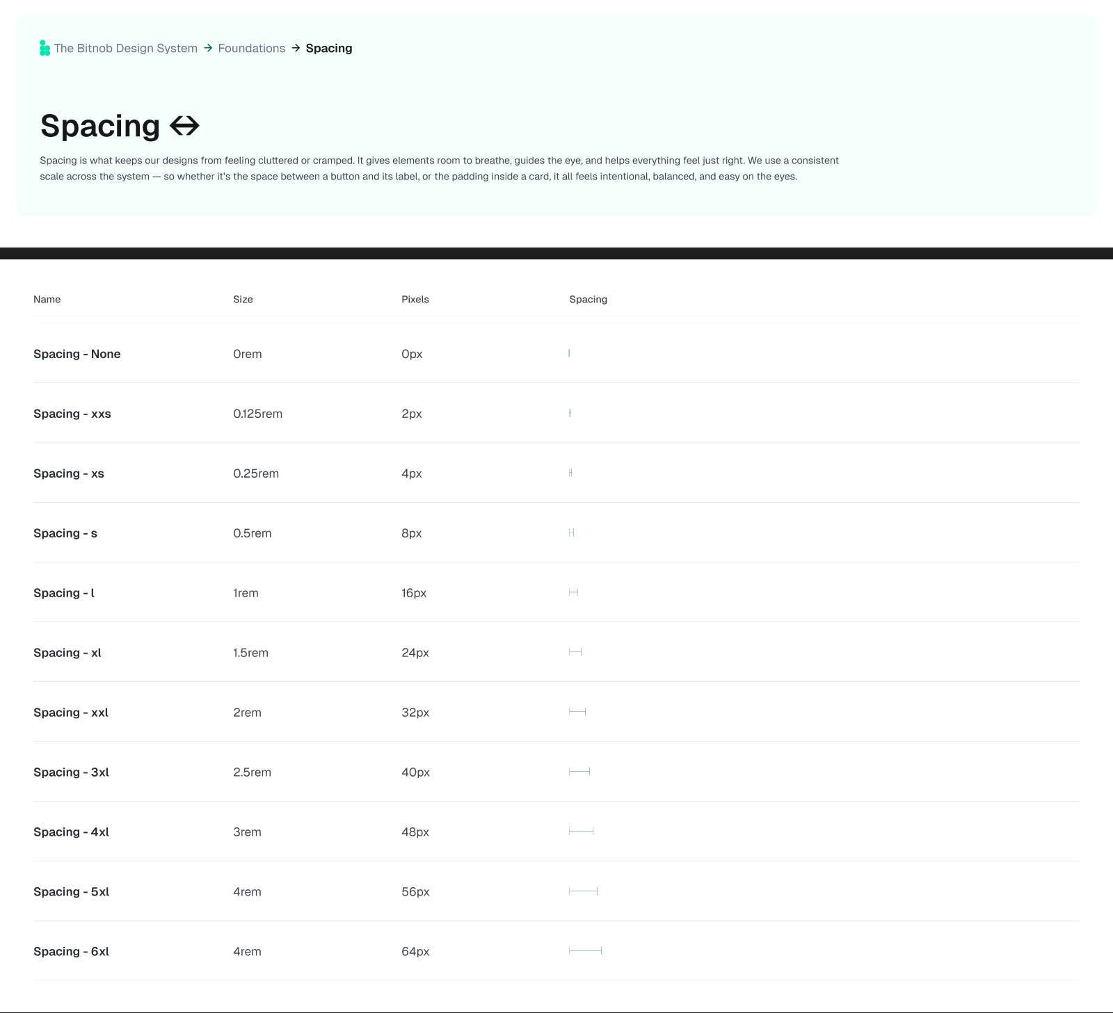
Spacing, radius and layout
A consistent spacing scale on a 4 and 8 pixel grid governs padding and margins, alongside named border radius and border width tokens. Responsive grids and layout patterns keep density and alignment predictable across breakpoints.
Effects and elevation
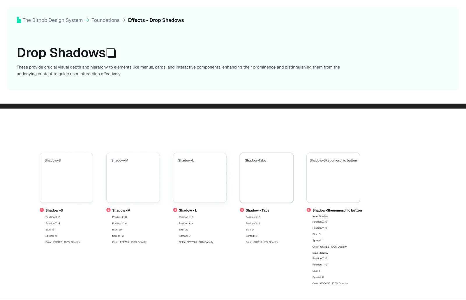
A small, named set of drop-shadow tokens gives depth and hierarchy to menus, cards and overlays, paired with a refined grey scale so surfaces read clearly in both themes.
Week two: core components
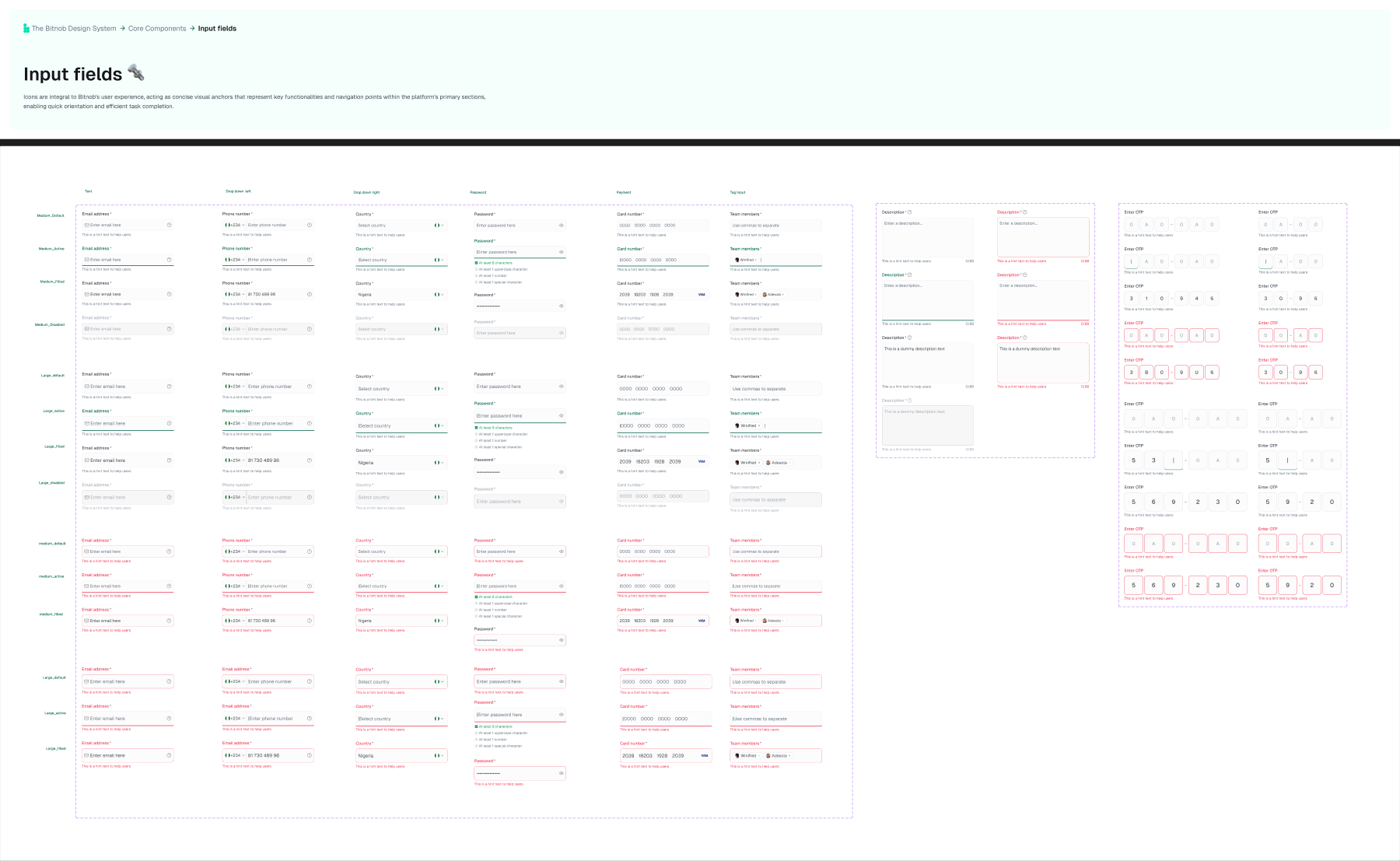
With foundations set, week two built the components teams reach for every day, each with its full range of states and clear usage guidance. Inputs were the humbling one: the more states, validation and edge cases we mapped, the more there was to get right.
- Buttons across types, sizes and states
- Inputs and text areas, with labels, helper text and validation
- Checkboxes, radios, dropdowns and toggles
- Avatars, date pickers and badges
Feedback and messaging
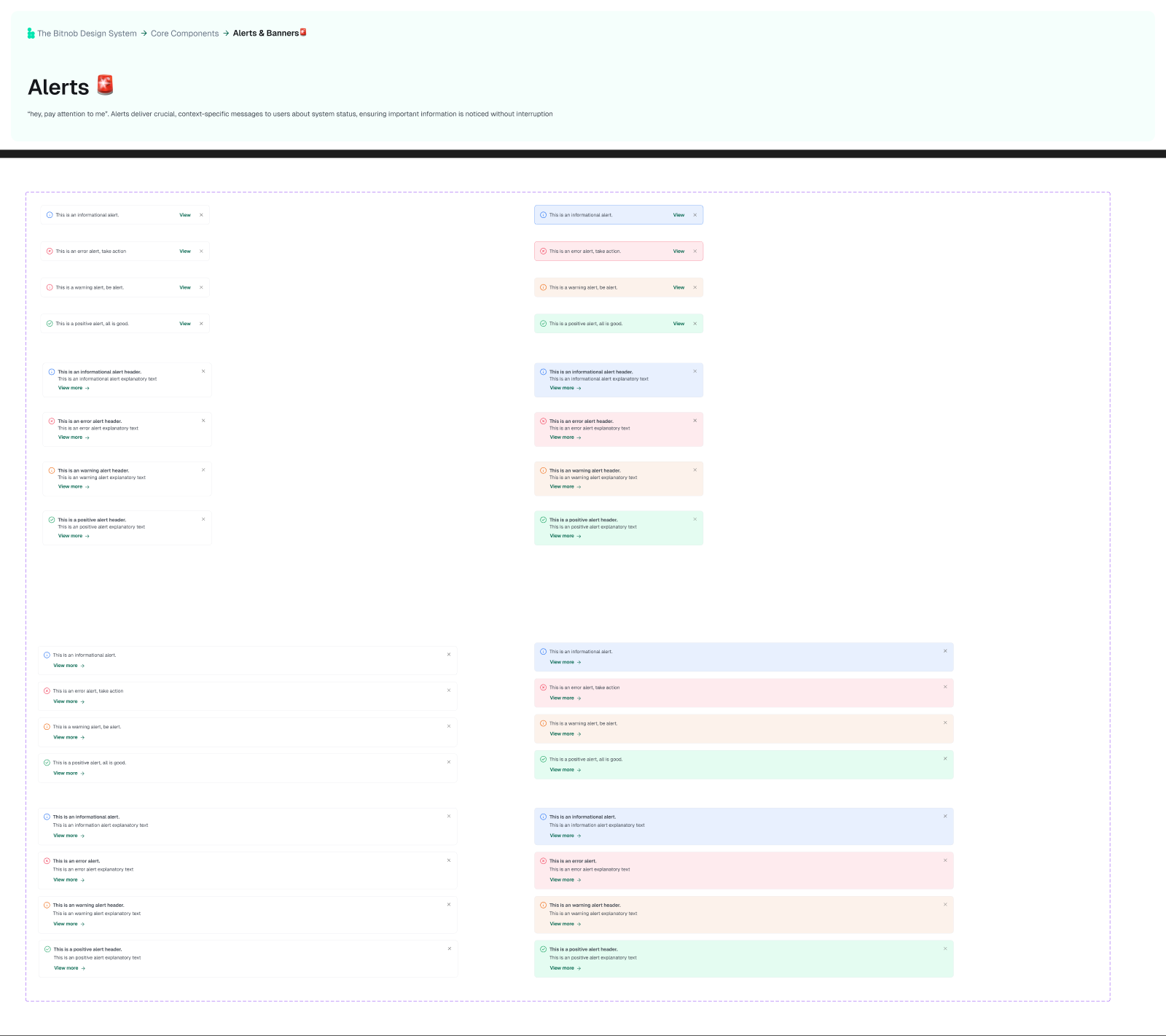
Week three moved to the patterns that carry meaning in fintech. Toasts, alerts, banners and tooltips were standardised across success, error, warning and info, with consistent placement and dismissal so users read the same signals the same way.
Data and tables
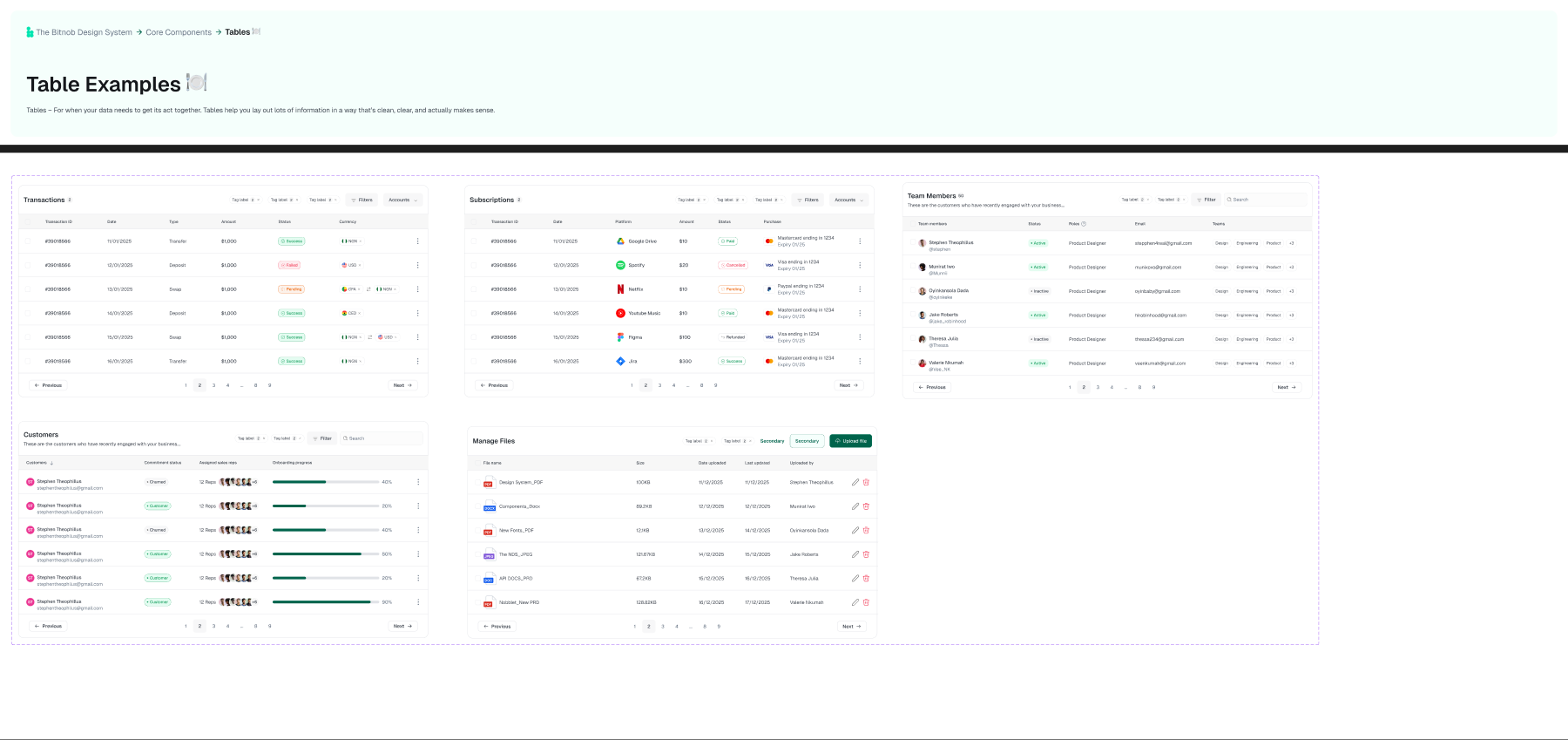
Business users live in data. The system ships table patterns with headers, sorting, filtering and pagination, plus progress indicators and data-visualisation guidance, so dense information stays legible at scale.
Overlays and navigation
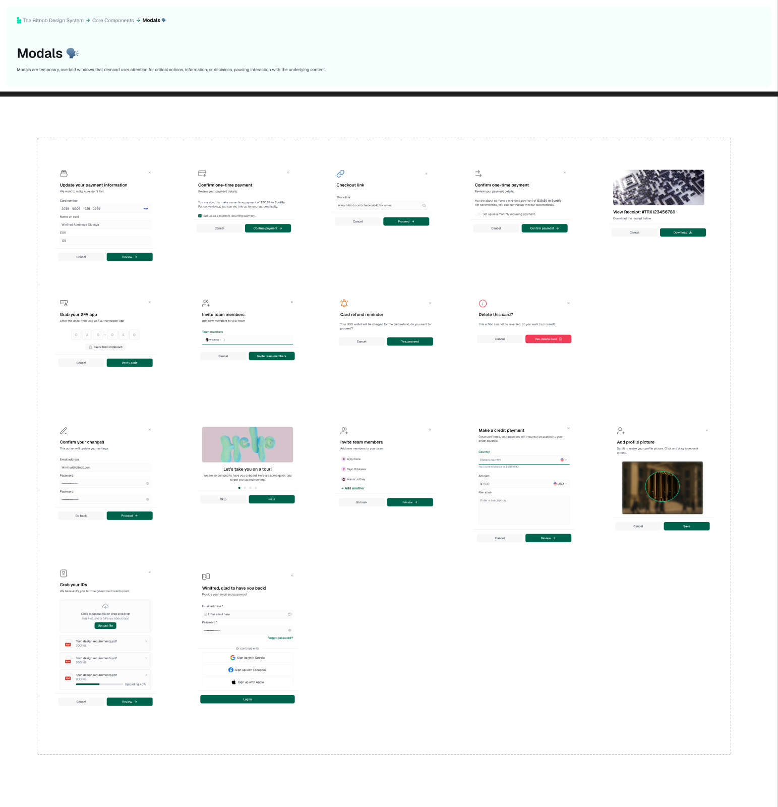
Modals, dialogs and side navigation defined the shell of the platform: predictable overlay behaviour, clear header, body and footer structure, and navigation patterns assembled from the same primitives as everything else.
Document everything
Figma held the in-context notes, and a living documentation portal became the single source of truth for tokens, components, props, usage and guidelines. Good documentation is what lets teams self-serve instead of interrupting each other.
Governance and adoption
The system was built in the open. A demo closed every week, stakeholders signed off at each stage, and a company-wide grand demo introduced it to everyone. A cool-off period and a quarterly review keep it a living product rather than a one-off deliverable.
- Weekly demos and stakeholder sign-off at each stage
- A company-wide grand demo at launch
- A cool-off period after the sprint
- A quarterly review to keep the system evolving
How we defined success
A few lessons I took away
A library is not a system.
Parts are the easy half. Standards, docs and governance are the real work.
Timebox to force decisions.
A three-week clock turned open debates into clear calls.
Inputs are never simple.
The humble text field ate more time than any other component.
Name for intent, not looks.
Semantic tokens survive redesigns. Raw values do not.
Govern in the open.
Weekly demos and sign-off keep people bought in, not surprised.
Transaction alerts for business banking
Read case studyHave something worth building?
I read every email. The best way to reach me is a short note about the problem — no deck required.